WHISKERS & WINE KIOSK, 2025
Designing a self-guided kiosk experience that encourages exploration and adoption

TYPE
Interactive Kiosk
DURATION
4 weeks
MY ROLE
End-to-end Designer
TOOLS
Figma, Inkscape
THE CHALLENGE
Missed connections and fewer adoptions
Whiskers & Wine is a cat café in San Diego where guests can meet adoptable cats. But many visitors leave without remembering the cats they met, especially the shy ones.
THE SOLUTION
A self-guided kiosk designed for exploration and connection
To help guests connect more meaningfully and encourage adoptions, I designed a playful, self-guided kiosk that makes it easy to explore, learn more about, and fall in love with every cat.
Explore
Browse adoptable cats and learn more about your favorites.
Match
Take a quick quiz and meet your feline match.
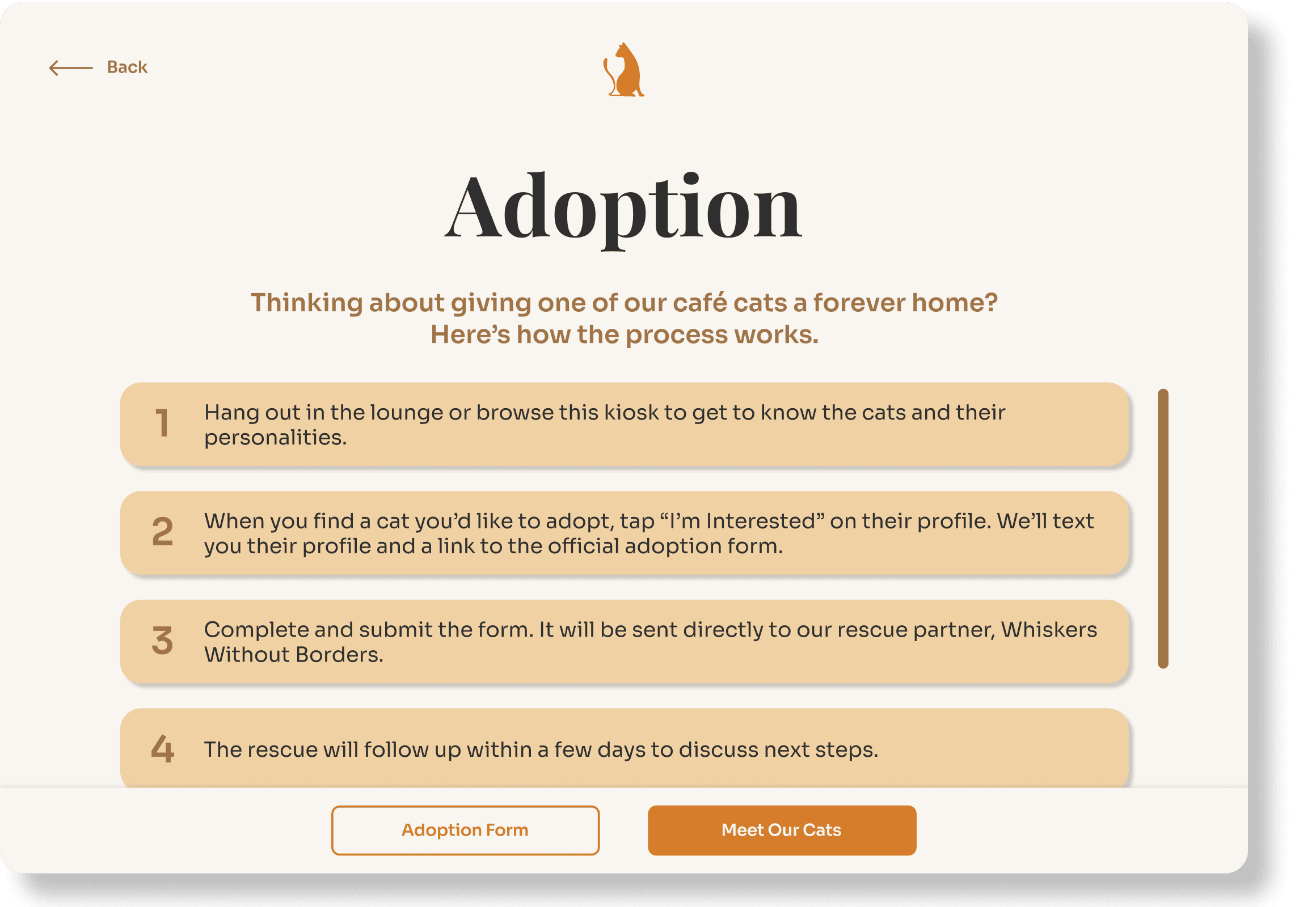
Adopt
Get clear, step-by-step guidance to start the adoption journey.
* Figma log-in required.

KEY FEATURES
Cat Catalogue
Browse a scrollable catalogue of all adoptable cats and tap into each profile to learn about their traits and personality.


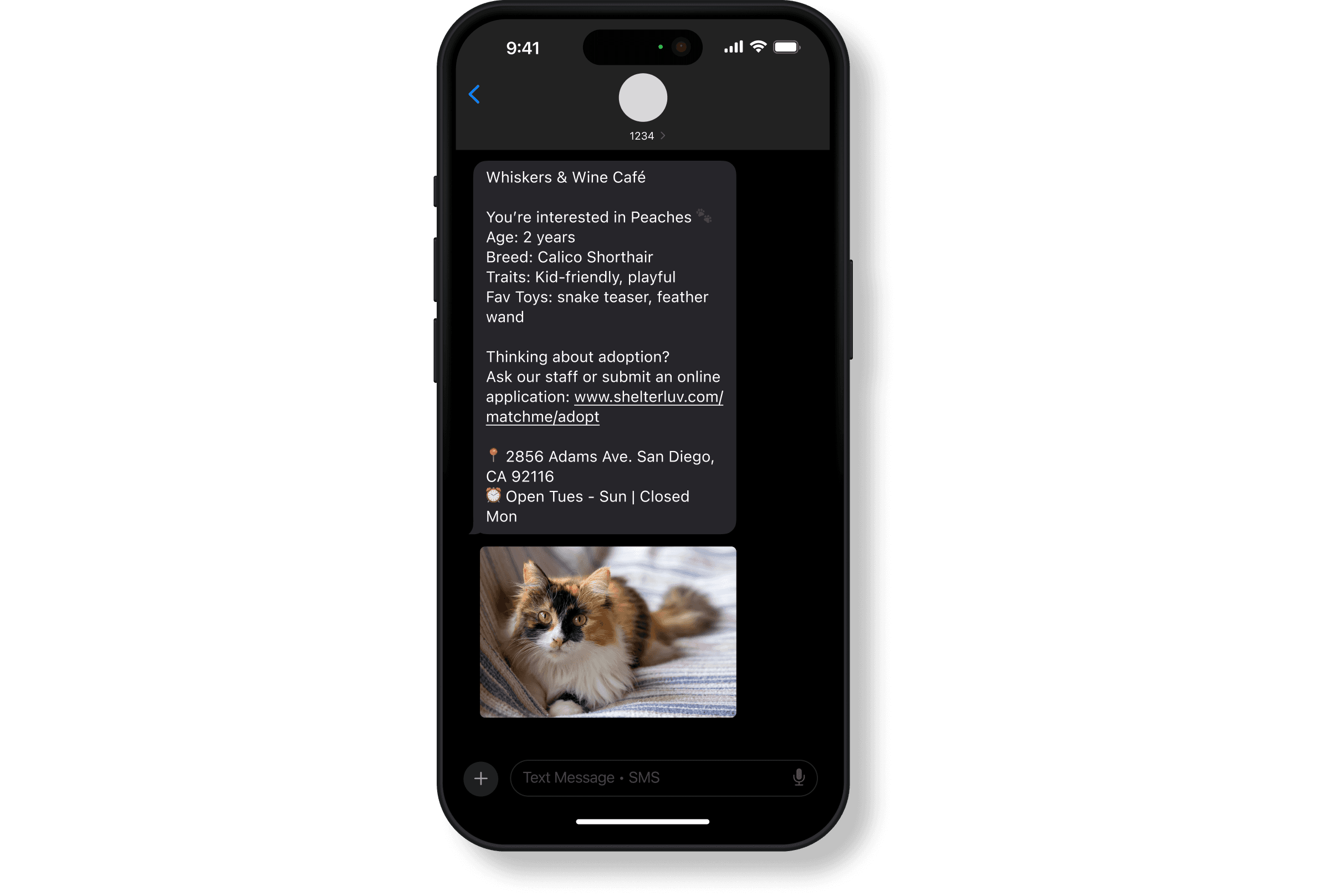
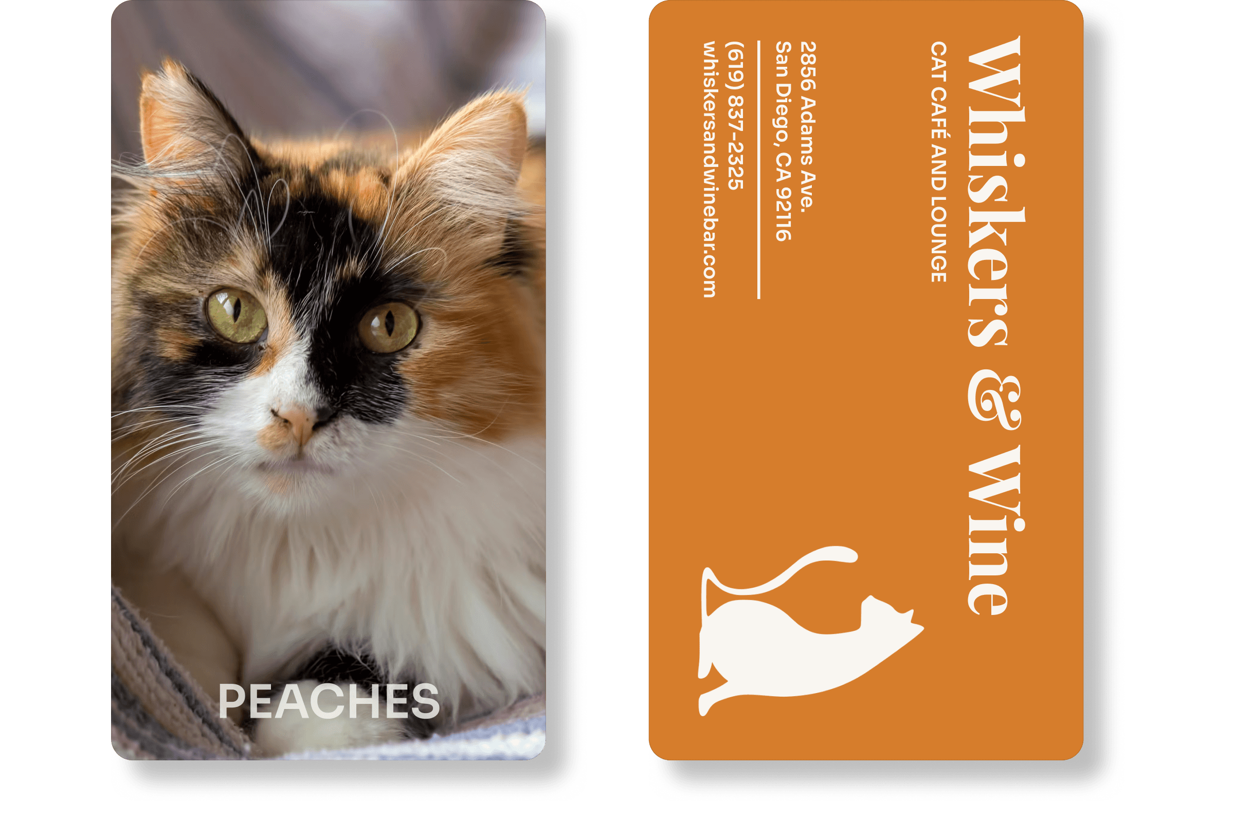
Remember Your Favorites
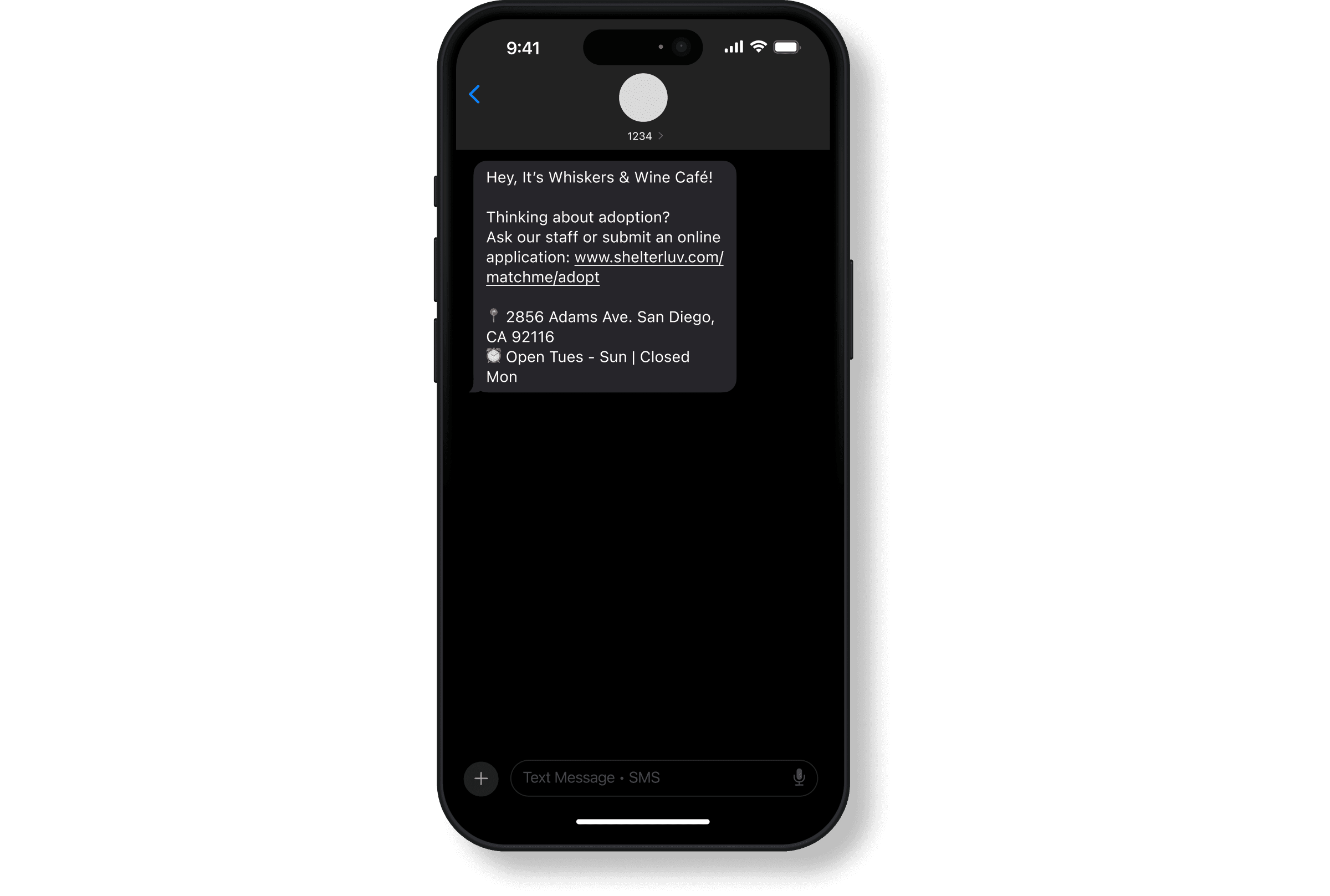
From any cat's profile, text their info to your phone or print a collectible photo card to take home.

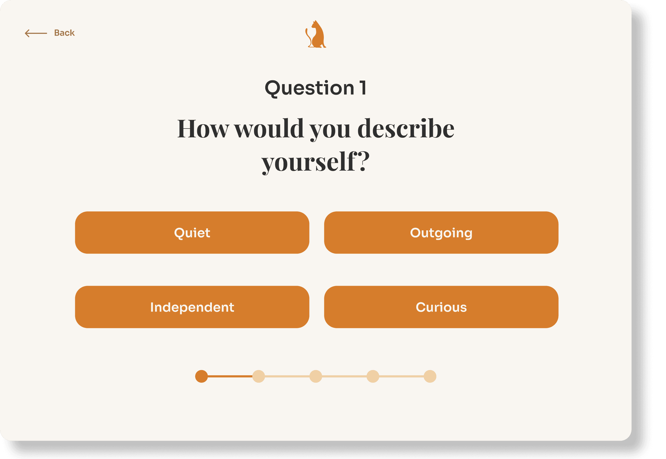
Cat Match Quiz
Take a quick personality quiz to get matched with a café cat that fits your vibe.


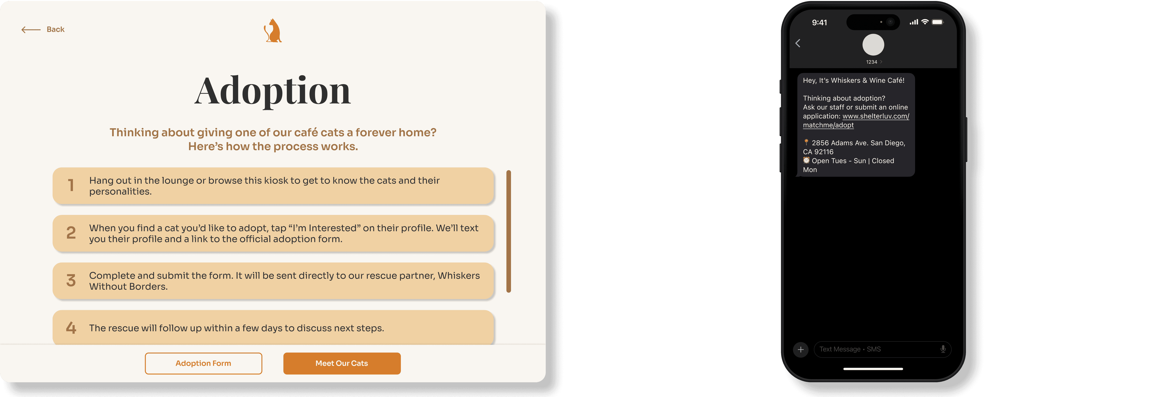
Easy Adoption Info
View clear steps to adopt and text yourself the adoption form to fill out when you're ready.
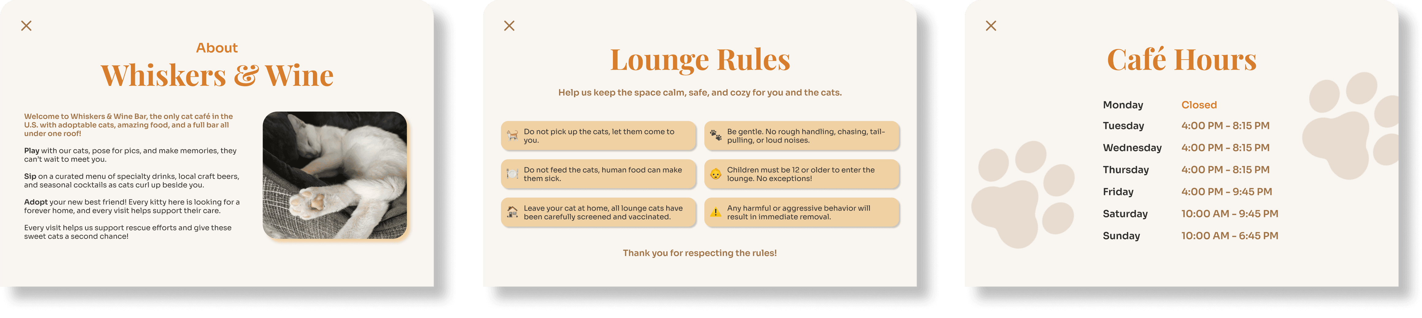
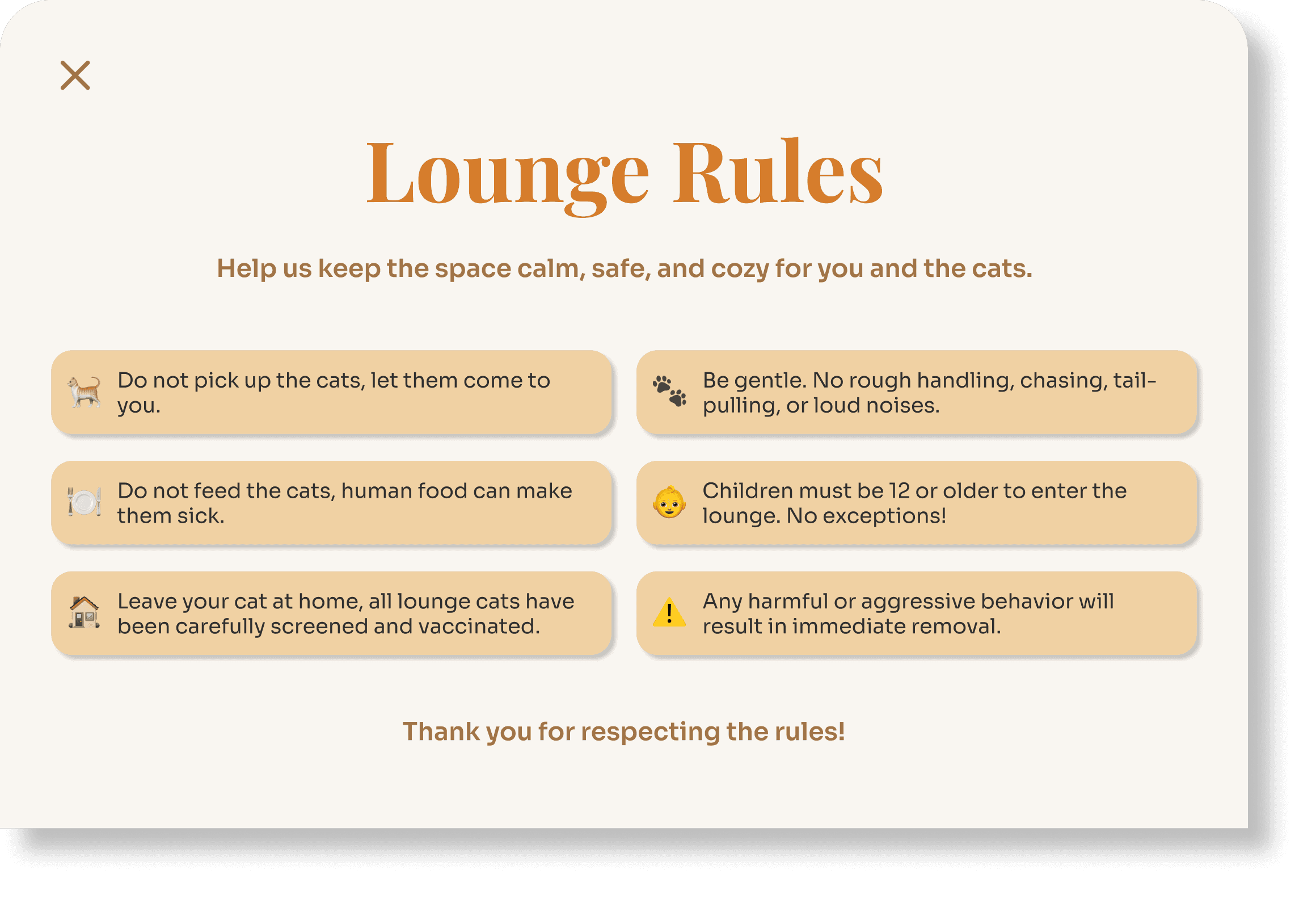
Café Info
Access lounge rules, café hours, and the café's story from the homepage.


RESEARCH
5 interviews and 50 online reviews
To better understand the needs of Whiskers & Wine and their staff and guests, we conducted five interviews with café guests and volunteer staff, and analyzed online reviews from sites like Google and Yelp.
“It’s usually the more outgoing cats that get adopted. The shy ones just sit in the corner.”
- Café Volunteer, 22
“Adopting would be easier if I was told how to do it upfront.”
- Café Visitor, 22
“My visit was confusing. It was $30 per person and you don't get anything.”
- Online Review
INSIGHTS
Confused guests and invisible cats
Shy cats were overlooked
Experience felt underwhelming
Adoption was unclear
Café rules weren't visible
COMPARATIVE ANALYSIS
Incorporating existing solutions to strike a balance between information and interactivity

Petfinder Website
Provides detailed profiles to help users make an informed decision early on.

Other Cat Cafés
Analog methods like boards or printed sheets with minimal info, accessible within café.

Best Friends Animal Society Kiosk
Emphasizes clear CTA and physical presence, making the kiosk's purpose obvious.
EARLY PROTOTYPES
Designing a more informative and memorable experience
Paper Prototype
Testing with two users confirmed that navigation felt smooth, but our approach to saving cat profiles needed more clarity and refinement.


Low-Fidelity Wireframes
In our low-fidelity wireframes, we replaced the original sign-in with a phone number prompt to make saving profiles feel easier and less intimidating, added loading screens to reduce user confusion during wait, and switched to vertical scrolling to encourage more intentional browsing. These wireframes guided our high-fidelity wireframes.

TESTING & IMPROVEMENTS
Refining based on real interactions
Relocating and expanding café info
Moved the "About" from the main CTA to the bottom nav bar and restructured it into three sliding drawers. This made key information easier to find and less visually overwhelming.

Clarifying adoption info
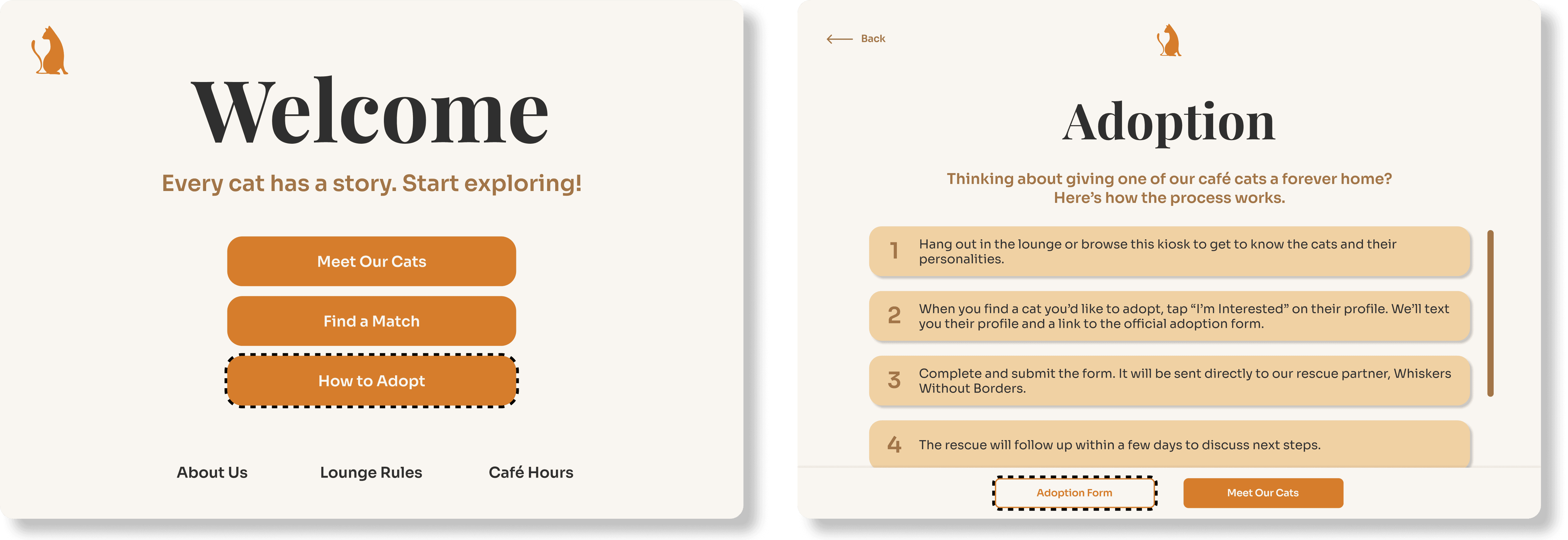
Improving print prompt clarity
Added a visible "one-per-visit" warning and context to the phone number prompt, after users expressed confusion about the need for input before printing a photo card.

WHERE WE LEFT OFF
A physical build and a little keepsake
Kiosk Build
We started the physical build with sketches and mockups, focusing on forms that felt inviting and communicate purpose.

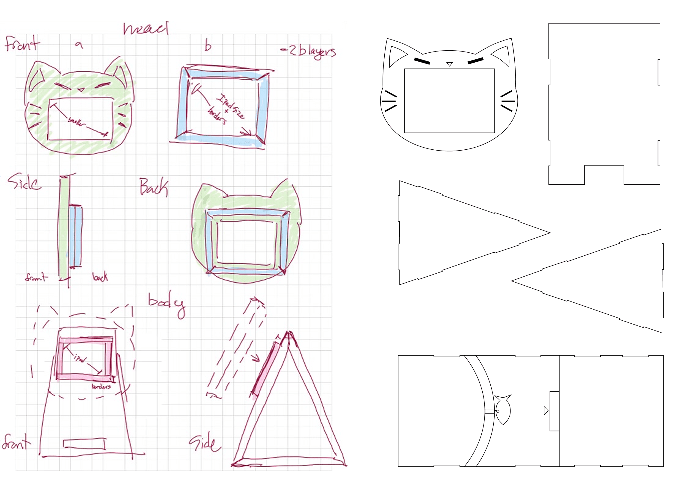
We landed on a cat-shaped design to tie into the café's identity and chose a larger stand to house the printer for photo cards.
Kiosk Prototype

REFLECTION
Designing isn't showing less, it's about showing what matters
Information ≠ Overload: Initially, I assumed users just needed quick actions, but many wanted more information. Rather than distracting from the experience, adding more information made it more valuable and useful.
Prompts Need Purpose: I thought the phone number input would be self-explanatory, but testing revealed confusion and resistance. Clear, well-placed context was essential to make the experience feel intentional and trustworthy.
Next Steps: If given the opportunity, future iterations would focus on testing the kiosk at the café, gathering adoption and engagement data, and refining the experience to better support both guests and staff.